Wednesday, 27 February 2019

CLASH Music Magazine

PREP Write freely about the house style of Clash music magazine. Your focus is on 'media language', that is, how the musicians are represented, layout, font, colour and so on.


Clash music magazine has a very unique house style. The main header for the magazine is in large, sans serif, bold, white font. Clash however, is a counterstereotype in the placement of the header logo. Music magaziness like MOJO have their logo partly shrouded by the main artist featuring on the magazine. CLASH however doesn't follow this stereotype, and instead they overlay their logo ontop of the artist. This could be because CLASH isn't a highly notorious magazine, so they need to make sure their logo is on display in order to grow a readership.
The CLASH music magazine is very clean and minimalist, which sets it apart from magazines like MOJO. There is little to no clutter on the front of their magazines, making it appear more sophisticated and more curated. The edition number is also a unique feature to CLASH as it is almost as if it is tumbling off of the face of the magazine. This could also help their readership easily identify the magazine from its competitors. 
CLASH also represent their artists on their magazine in multiple different ways, this frequently changes. In the edition containing the 1975, the artist is presented in an almost angelic, holy way. As if he was an icon. This could lead the reader into believing that this artist is a god amongst men and could further implore them to buy that edition. In other editions its the polar opposite, as in the Living in Darkness edition, the artist is presented as looking down at the reader, this is again a counterstereotype as in music magazines, arists are usually making eye contact with the reader. This further emphasises CLASH magazines uniqueness in the music magazine world.
CLASH music magazine is also very broad with their colour palette, with music magazine covers sometimes being awash with colour, and in other times bearing very little at all. Some of the magazine front covers are in a monochromatic colour style, implying that the artist is very formal, whereas in others they use vibrant colours such as purples and yellows, and even in one change the colour of the CLASH logo, this could further suggest to the reader that the artist featured is one to break the social normalities. 


Monday, 11 February 2019

LEGO movie ad break representations

Please watch this presentation. It explains one of the ways in which the conglomerate Warner Bros marketed its product, The Lego Movie, by creating an ad break. The ad break is one of your required texts set by the exam board. 

The LEGO Movie ad break shown on ITV is a clever way of incorprating a large scale advertisement into an ad break of a programme. The ads are the same in the LEGO movie ad break as they are if they weren't 'LEGOified'. The ads have been redone in the style of concurrent LEGO figurines and are representative of the character they are playing in the original ad. Four ads were reanimated in the LEGO style: Confused.com, BHF, BT and Premier Inn. These are all well known advertisements, and due to the fact that they are done in LEGO form, the audience would be able to connote the adverts have been done to advertise the LEGO movie.

The LEGO movie ad break has redone the specific ads 1:1 for example, in the Confused.com advert, the robot has been redone in the form of LEGO, using well known bricks that LEGO fanatics would recognises.

The end of the ad break there is an advert for the LEGO movie itself. This is probably used in order to reinforce the audiences preconceptions that the ad break is dedicated to the LEGO movie. This advert could've been used to grab the attentions of the younger audience, to whom the film is targeted at. The LEGO figures that have been used in the ad are from well known sets, so even to the casual LEGO builder, they will recognise the 2x2 red bricks and some of the characters from other movies and sets. This will entice the audience and encourage them to watch the film.

Thursday, 31 January 2019

02 Music and News Q.4 Bob Marley

 Refer to Extract 1 in the insert. Analyse the representation of Jamaican Reggae music and
musicians such as Bob Marley in this MOJO front cover. (5 marks)
In the MOJO magazine cover of Bob Marley, he is represented as a kind and open person. The natural lighting used on the artists face and the broad smile and body language help to convey this idea of openness. Reggae has been presented as very exoctic and vibrant, with the colours of reggae being used (red, yellow, green). These colours are closely associated with reggae music, so if people didn't know who the artist was, they could guess the genre of music he produces. This form of music is a counter stereotype as it is usually rock musicians presented on MOJO magazines.

The magazine also talks about the struggle of artists, in true MOJO fashion. At the top of the magazine 'Bowie, the lost album' and 'From gang war, to love' This shows the darker side to the music industry and how the artists have struggled in their carreer, in true MOJO style, a stereotype they have built up over the years.


Monday, 28 January 2019

02 Music & News Q.4 MOJO Magazine

PREP for year 11 TUESDAY 22 January and for Year 10 WEDNESDAY 23 January.
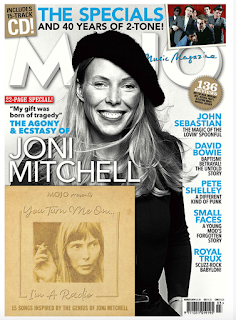
MOJO Another quick and easy revision prep, worth 5 marks. Base your analysis on MOJO's March 2019 issue. the exam question won't have the covermount (free CD) so don't refer to it.


The MOJO magazine utilizes the use of a monochromatic colour palette with accents of blue. These bland colours connote a serious tone and the blues could reflect the music artists modernity. This idea of the monochromatic colour palette is reinforced by the choice to make the main splash, Joni Mitchell, a black and white photo. The use of the phrase 'The angony and ecstasy' can also hint towards the idea of her potentially traumatic music life. There is also an atmosphere of seriousness and importance with the use of a sans serif font for the main splash title.

The main splash is also a bit unusual, as the world of rock is mostly male dominated, which is shown through the other stories inside the magazine on the sides of the cover. This is a counter stereotype to the MOJO magazine and can suggest that Joni is a pioneer for women in the patriarchal world of rock. This idea is reinforced by the orderly block capitals of the main splash 'JONI MITCHELL' as it connotes a masculine attire


Tuesday, 22 January 2019

Exam Q.8 Revision

PREP
To revise the 'media language' question, you focus on the layout. It is a quick and easy question, worth 5 marks and only 2 examples needed. Please copy the question onto your blog and write the 2 examples taken from the recent Observer online. The answers below will help you.
Exam q.8 (5 marks, write 1/2 a page; give 2 examples)


The Guardian Observer homepage uses a variety of media language techniques in order to present the themes of the newspaper. One of the ways the Observer portrays this is through the choice of colour palette. The Observer uses royal blue colours with the Burgundy accents. These colours connote a sense of urgency and importance regarding the newspaper, implying that the newspaper will tackle hard news and won't shy away from thesse topics which it doesn't.

Another form of media language used is the layout. The layout of the news articles are also very ordered, speparated into categories. They are also alinged in columns and separated by a box outline. This means that it is easy to the eye and creates a atmosphere of importance and suggests that it is a serious newspaper.

Monday, 21 January 2019

Exam Question 9 Revision


1. The major use of newspapers is to offer a sense of knowing
what is going on in the world.The Observer knows that its readers are serious and interested in international affairs. This is evident in hard news articles about.....Brexit and Donald Trump and Labours plan to topple Theresa May.
2. The Observer meets its audience's need for a range of cultural, sporting and artistic news. It provides these with...articles about the 2019 Brit awards and Dua Lipa topping it.

3. The Observer does not shy away from 'difficult' issues that could make uncomfortable reading, such as...a Saudi teen's "long journey to safety". They also openly talk about the serious crimes committed on parole soaring to 50% and the Irainian hunger strikes. 

4. The Observer has sections which are designed to appeal to
different types of readers.The Observer reflects the diversity of its readership in articles on...Politics, Education, Entertainment and Business.

5. Newspaper readership can still be used as a symbol of one’s social identity. The term ‘Guardian reader’ connotes a certain
type of social attitude and The Observer similarly reinforces
a set of social and political attitudes, and thus identity, in its
representations. For example, Observer readers like to think
of themselves as open-minded and this is reflected in the
Observer’s practice of allowing both sides of an argument
equally to be put when the newspaper is clearly on one side
of this argument. There is an example of this in....the two separate articles about Dag Hammarskjold as well as opinion pieces on Brexit. They also mention the 'Yellow vest protests' and the riots in Paris.

6. The entertainment function of newspapers may take the
form of humour. It may take the form of diversion into
a celebrity world of ‘glamour’. It may take the form of human
interest stories in which readers are invited to sympathise with
the subjects of the article. Newspapers further offer games,
puzzles, crosswords and the like. At the higher end, sections
such as the New Review in the Observer may offer the pleasure of extremely well-written think pieces and literature reviews. An example of this is....various articles on Body Image.

Monday, 14 January 2019

Year 11 PREP: MUSIC VIDEO Q.2

Wheatus - Teenage Dirtbag and Avril Lavigne - Sk8er Boi
PREP: To revise for q.2 (4 marks), copy / paste each of the following descriptions into your blog post. Write either SB or TD at the start of each, to indicate either Avril or Wheatus. Some answers may refer to BOTH so put both initials.


This video is documentary style mostly hand-held camerawork, de-saturated colour and fast-paced editing.
Sk8er Boi
This video has saturated colour, more controlled camerawork, slower-paced editing.
Teenage Dirtbag
This video consists of mostly montage shots.
Sk8er Boi
This video has more developed editing with cause and effect.
Teenage Dirtbag
In this video, the singer values rebellion, which is seen in the narrative.
Sk8er Boi
In this video, the singer values 'fitting in', conformity, albeit to an oppressive system, which is seen in the 
narrative.
Teenage Dirtbag
This video is set in LA, a big city, with its connotations of street credibility.
Sk8er Boi
The mise-en-scene of this video is American suburbia with its connotations of conformity. 
Sk8er Boi
This video is intertextual in its narrative (=it makes references to high school drama).
Both
In this video, the singer performs to camera.
Both
In this video, real locations and 'everyday' costume for the performers connote a sense of naturalism.
Teenage Dirtbag more so than Sk8er Boi, as Avril wears 'rebellious clothing' which is uncommon
In this video, there is a sense of linear narrative (a story is told, in the order it unfolds)
Both

Wednesday, 12 December 2018

Media Revision: Music Magazines


  • The font used for the main splash is Sans serif, meaning without serif. This is a very modern representation and suggests that this magazine is very up to date and focuses on modern music news. The 'All Saints' font is also in a stencil style which could bring in the idea of masculinity and military style, i will link back to this later.
  • The dress code for the band is also very masculine. This could hint at the masculine appeal they band has, or the opposite and how they are modern women and don't conform to the traditional views of women. They are wearing a basic set in terms of colour palette and it is mainly black and white. This could be reflective of the magazine cover too as it is similar to the colour palette used there.
  • The group that are the main splash are very assertive in their pose, almost military and they stare at the camera intently. This could connote ideas that they don't conform to the rules of society and they feel different from everyone else. This can be further reinforced by the quote pulled from their interview 'We always felt like outsiders' and 'We didn't conform to the rules'. It is also obvious they are the main part of the magazine as they take up the majority of the space on the page and the font size for their band name is also the biggest on the page, in contention with the magazine logo.
  • The layout to the magazine is also very grid lined so this can further strengthen the military style of the band and their way of representation. The grid lines also hold structure in the front page, making it easy to find stories contained within the magazine.
  • Other musicians are mentioned at the bottom of the page such as Paul Young and other special interviews are also made clear to read. This can help to still attract readers that aren't so much interested in the main splash but are fans of the music magazine, We Love Pop. Situating this at the bottom of the page, it makes the interviews easier to locate, however the font size is relatively small so it has been made apparent to the reader that We Love Pop doesn't think they are as important as the 'All Saints' are. 
  • The magazine also shows other music celebrities and important people in the music industry to help to further draw potential readers in as they are trying to show the wide variety of music and musicians they incorperate into their issues.

Saturday, 14 April 2018

Cuffs Exam Question 3

How far does the extract try to create a sense that it is portraying 'real life'?

  • In your answer you should: analyse aspects of the extract giving detailed examples 
  • judge how far these aspects create a sense of watching 'real life'


In the extract, 'Cuffs' there are many different ways that they make the scene look 'realistic'. One of these are certain cultural references. In the opening scene of the extract, there are two policewomen. One of them is wearing a hijab. A hijab is a Islamic piece of clothing and with this they are not only bringing realism, but also adds diversity to the cast and the series as a whole. There is also use of natural lighting. This also adds realism, as the lighting is not unnatural, that being there is no external or obvious lights used in order to make the scene look as though you are there with the actors.

The scene location is also very important. In this extract it is a shopping center and a motorway in Brighton. Some people who watch the programme may know the location in real life, and/or visited it. The scenes in the extract also portray real life events and struggles that many people face on a day to day life. They don't attempt to censor anything unless it is direct violence or a 'bloodly' scene.

Friday, 16 March 2018

Double Page Spread Work


This is the double page spread Joe an I made in Photoshop. In the lesson, we tried Adobe InDesign. However the software was significantly harder to use so we switched over to Photoshop. In what took us five minutes, we generated the end product that took us almost the entire lesson.

The Final Product

In the final product, I took charge of the aesthetic prospect of everything. As we did it on the Electronic Hip Hop band Gorillaz, Joe wrote the article as I had little knowledge of them.


Friday, 23 February 2018

Cuffs Exam Question 2


How is sound used to create meaning? Give at least two examples.(5marks) 

Notes

Non digetic sound with the everyday noise of a bustling pier
Squeal of the JCB's tires
Non digetic sound with the crashing of the glass and the whirring of the JCB forklift
Digetic Radio walkie talkie off screen sound, we listen to the conversation. Contrast with the shock of the robbery. As they hear this they jump into action, cueing the post production editing of an up tempo song playing.
Police sirens is non digetic, there is music in the background to add a rhythm
As they are called into action, the main police officers voice becomes harsh and loud. Each officer shouts at one another to convey information.
Sounds of the police cars adds to the effect of the police car accelerating, this conveys the way they are driving.
The song changes and ups the tempo even more and also becomes louder.
Inside the van, an announcement requesting back up
The rookie police officer blunders with the commentary of the situation at hand. This is digetic.

My Answer

The smashing of the glass also connotes images of violence and the action of the scene. Partnered with the sounds of people in distress, this gives off the effect of anarchy.

Without the post production music and sound effects added would put the viewer in the dark. The squealing of the wheels and the roaring of the engine connote danger and a sense of urgency. The squeals show the reader the high speed at which the car is driving. The screeching and the earsplitting siren also connotes police urgency as you usually hear it when the police are called into action.

Post production music, also adds a certain tone to a specific event happening on-screen. When the chase scene begins, up tempo music starts playing in the background to make the viewer on edge. This is effective as the specific choice of music will connote certain emotions such as urgency and fear. 

Wednesday, 31 January 2018

Media Question 8


On the front page of the observer, they have boxes containing the story you will find if you decide to click on them. They have a punchy Title and on the smaller ones, a small description of what the story entails. There is a subcategory called featured, which are the trending/important stories on the Observer website. This is important as it can bring more people into their site to read their stories they have on offer. There is also an image on the front of the boxes that have a slight relation to the story too. The colour scheme of the Observer is classy and is considered as professional colours, which on a newspaper website shows the sophisticated nature of it.

The typeface used is important too. There are two different types of typefaces, Serif and Sans Serif. Sans means without, the Serif is the detail on the side of the letters. So Sans Serif means without Serif. Arial font (The one used now) is an example of a Sans Serif font. Serif fonts make the reading of big text extracts easier as the brain sees the font linking to the other words. This is why it is used so frequently on older broadsheet newspapers. In this case the Observer newspaper website uses Serif font as it is more sophisticated than a Sans Serif. 

The uses of narrative change from each story, The main story on the front page is in first person as the person who wrote the story refers to themselves as I. The next story is in third person and refers to the guy in it (Jordan Peele) as his name, this is third person. There is also a story written in the second person, this is referring to the reader as you or your. It is an effective way of breaking the fourth wall and connecting to the reader, as it seems they are talking to someone rather than a page on a website.

The first story on the front page is a controversial and involves gender politics.This is engages the reader as it is a sensitive topic to talk about, this will overpower the moral side of the reader and their curiosity may get the better of them. 

Friday, 19 January 2018

My Media Production Company

IGNITE FLIMS

I named my production company is named IGNITE FILMS. I did this because it is based on my username on many gaming platforms that I use on a daily basis. I brain-stormed for logo ideas. I got ideas from a marketing workshop i visited and logos i had made prior to this one. I will show you the steps i went through in order to create the image above (my header) and the Ident which is on my Youtube Channel which is linked last.

I opened up my copy of Photoshop CS6 2018 and created a 1920 x 1080 canvas with a black background. I made the background into a layer and named it Gradient. I chose the Ellipse tool to make a circle, to make is perfect i held Ctrl + Shift in order to make it a perfect circle. i filled it to be white and thus the main circles had been born. The dotted lines were made with the Ellipse tool again, however i changed the line to dotted and made it smaller. I proceeded to add some text in a font i downloaded called Laser84. Laser84 is an 80's style font that is really aesthetically pleasing to me. I added stroke to it and made the stroke 5px large. Next i created a clipping mask to be able to make the circle and the stroke on the font look like a galaxy. To do this, i place the image on the canvas and made it the bigger than the main circle. I right clicked the galaxy image layer and created the clipping mask. I created many versions of the logo using differing images.


I also created my Media Eye-dent. To do this i used two programmes Adobe After Effects CS6 2018 and Adobe Premier Pro CS6 2018.

First of all I downloaded the Saber plugin for Ae for the fire effect. I created some flare for the background by using the particle effect, moving it to the bottom right-hand-side of the screen and changed the settings of the particles so they would float and spread them out. Please note that the type of particle was shaded sphere. Then i coloured them a nice fiery orange colour. The reason i chose orange is because it links to the name of my media productions company, IGNITE being the verb to ignite a fire. I then imported a transparent PNG file of the logo into the composition. Please note a transparent image is going to be easier to use when doing this as you wont have to keylight the background.

Next I added the Saber plugin to my logo. The style of effects had a really wide choice, however i found the fire choice and applied it. I changed the layer it would effect to the logo and toned down the brightness of the flames as you could not really see the words in the logo. The actual fire effect was also altered as the fire interfered slightly with the parts of the logo, linking things that should not be linked. After the effects had been changed to my preferences I added the logo again, this was to allow the fire effect to fade out when the logo faded in. I added keyframes from the two second mark to the three second mark to make the fire take time to fully form and slowly disappear. After that had been successfully applied I proceeded to add the effect, Venetian Blinds, to the unaffected logo to make it fade in. I changed the width of the blinds to 10 and changed the direction to 45 degrees. I set it so that from the two second mark to the three second mark it would fade into its full form.

Youtube Channel for the Ident

Friday, 5 January 2018

Exam Question LEGO MOVIE POSTERS


The typeface used in the LEGO Movie is a custom one designed specifically for the movie. This therefore allows the audience to familiarize themselves with the font as it is only be seen on the LEGO movie posters. On the poster it is put in the top center and is significantly larger than that of other text on the poster. In the individual posters the actor is put along-side a picture of the character that the viewer of the film will see them play/voice-over. This allows the audience to see and recognise familiar actors they have watched prior to watching this film. Parents will be able to relate to other actors such as Chris Pratt, Elizabeth Banks, Morgan Freeman and Will Ferrell.

The slogan has been used to appeal to the average LEGO builder. The wording used in the slogan makes is appear if the creators of the film are going to 'assemble' the film on the release date. This relates to the average LEGO builder as they are 'assembling' the LEGO sets. The verb assembling also makes the film stand out compared to other films, as their release date, coming 2018 seems bland.

The images in the posters feature the main and central characters in the center so that movie goers or people that have seen the movie can affiliate themselves with characters in the film and build an emotional bond with them. The figure of each character in the posters also are LEGO character models. This creates a sense of nostalgia for parents watching the film and knowledge that the film is child friendly and won't have serious gore in it. For the children the blocks and the way the characters have been shown in their LEGO models will create a correlation between the things they love to play with on a regular basis and the fun times they have had with individual character, many of them coming from iconic LEGO sets. The scene is also completely made out of LEGO bricks adding to the assembly aspect.

In the ensemble poster, the facial expressions show a lot of what personality each character has. The large majority of characters have a serious face on as if they are about to go to battle. There is one character who stands out though, Emmit. Emmit's face is him looking completely out of his mind scared. This is an effective use of both comedy and it allows the viewer to see aspects of themselves in Emmit. People usually themselves as the nobody, and they want to make a difference. Emmit is that sort of character which we can relate to. He is also placed in the center so we know he is the main character. 

The image on the ensemble poster has an explosion in the background showing Lord Business with an angry expression. The explosion acts as the spectacle of the the poster. The animation of the film provides an element of escapism from the film.

Friday, 8 December 2017

Exam Question 8 Gratifications

The Blumler and Katz theory suggests that people use the media to satisfy their needs. They managed to narrow it down to four key main ideas:

  • Escapism from everyday life
  • Surveillance and information
  • Personal relationships
  • Personal identity
The LEGO movie does very well at the escapism aspect of the theory. The LEGO movie is an action/thriller genre movie, the LEGO explosions and very cleverly animated fight scenes create a tense atmosphere. The atmosphere helps to divert people from the worries of everyday life and focus on the scenes happening in front of them.

The personal relationships are dealt with very efficiently within the LEGO movie. The viewer can relate to Emmet well as he is the nobody and humans naturally tend to be pessimistic and criticize themselves a lot harsher than other people. The average viewer will relate to the small guy or the 'underdog' this makes the audience take a shine to Emmet, which makes him such a great main character. The same goes for Lord Business, he is portrayed as the antagonist. In the movie he releases the Kragle which is the super glue that Lord Business plans on gluing the entire city together and make sure no one can change the way that the city is. He wants people to follow the rules as if it was a bible.

Surveillance is not really covered as thoroughly in the LEGO movie. so there is not much to explain about on that front.


Thursday, 30 November 2017

Music Magazine - Contrasts

PREP: Analyse the media language of the MOJO cover below. Use the terms that you have learned. 
Compare and contrast the cover with another magazine cover, drawing attention to the similarities and differences, and saying what the genre codes and conventions are.

The contrast cover can either be your own cover or another professional cover.


Image result for music magazine

There are two photos above, one of the MOJO magazine featuring David Bowie as the main splash and the other a Billboard Katy Perry magazine. Both these magazines have similarities and differences that i shall highlight.

A similarity they both have is the placement of the main splash. The photo taken is a full-body shot and they are put in the center of the magazine with their eyes looking right at the potential reader. Both of the pictures have the music artist covering part of the magazine logo as well which is effective as the reader can still see a majority of the logo so regular readers know its a MOJO magazine or a Billboard magazine. Both magazines have other stories within the magazine showing an insight as to what is in the issue.

The Katy Perry magazine places Katy right in the center of the magazine. This diverts the magazine from portraying Katy Perry as being a provocative character, but rather a strong and independent woman. The MOJO magazine does the same as David Bowie is standing in a very dominant pose which in the army is 'at ease'. These postures help to convey their personality. Katy Perry has many curves in her posture which is a very feminine look, as men tend to be portrayed as have wide shoulders and being quite stocky. The curves in Katy Perry's posture contrast with the curves in her hair making her look very soft and natural.

A big difference  in the magazine covers is that the Katy Perry Billboard magazine lacks a Pug which could have a major effect on sales of the magazine as it does not promote a special feature or once in a lifetime free item included with the magazine. The use of Pugs help to boost sales as it draws the reader in as if the magazine includes a once in a lifetime opportunity only included with this issue of the magazine.

Another bid difference between the magazines is the position of the main splash text on the cover. The MOJO magazine has the surname of David Bowie positioned right in the center of the page in order for the reader to find it easily. In contrast, the Billboard magazine has the main splash of Katy Perry on the left hand side of the cover in a bigger text size than that of the other stories involved with the magazine. The pro of having the main splash text in a significantly bigger size and font is that it draws attention to the main splash of the magazine. Human brains are very good at detecting anomalies in certain patterns. The difference in size and in font draws the attention of the eye very quickly.

Wednesday, 22 November 2017

02 MUSIC: MOJO COVER 2017

How representations on magazine covers reflect the social and cultural contexts in which they were produced


  • Claims they are the biggest UK music magazine
  • For those truly obsessed with music. 
  • Claims that the MOJO magazine is the music expert
  • A magazine of high values and integrity
  • Claims that if your featured in one of their magazines you matter
  • Carefully crafted music archive
Sex Pistols Information

The Sex Pistols were a punk rock band that were active between 1975 and 2008. They were a very loud and in-your-face band that did what they want regardless of how society portrayed them. The Sex Pistols were controversial band as they did many things that were considered socially unacceptable such as swearing on TV and slouching and singing songs about controversial things happening in the world. The group would sometimes refer to themselves as being anarchists and rebelling against the state. They brought a very harsh and rebellious mood to the music industry that before-hand had never been seen before. 

In the MOJO magazine cover they use two main colours, acid yellow and hot pink. This is because they are contrasting colours and the album 'Never mind the Bollocks' had the Sex Pistols in hot pink with an acid yellow background. This means if a Sex Pistols fan walks by the magazine, they can tell its about the Sex Pistols as the colours are quite prominent of the cover.

On the cover, above the magazine logo, there is a sneak peek of a article about the Allman Brothers. The position of it is very important as it is above the logo which means the article is important. The Allman Brothers was an American rock band formed in 1969 founded by brothers Gregg Allman and Duane Allman. Duane Allman died 1 month before his 25th birthday, however, the band carried on.

Tuesday, 14 November 2017

LANGUAGE IN MEDIA

PREP MUSIC VIDEO CODES AND CONVENTIONS 
To prepare for the exam, we look at the media language of music videos, such as their codes and conventions below. For prep, copy the points in colour then add your own points in black. 
  1. Performance - the singer / band are seen to be singing and playing (including lip synching), to provide authenticity, so that followers believe in the talent and can see their star. Record labels sign stars and promote them  to ensure sales. Avril Lavigne sings throughout the video using a mike and draws a huge crowd of fans around her when she jumps onto a car roof in the street. She sings with great passion, energy and conviction, holding the mike close to her mouth. Close-ups show her every word (lip synching is a feature of music videos.) She performs for her fans and for her 'boyfriend' the sk8er boi who features in the narrative. Screens often feature in music video and the sk8er boi is videoing Avril Lavigne as he gazes adoringly up at her. She returns his gaze as she sings about 'we rock each other's world'. The performance element creates authenticity (fans have proof of her talent) because we see her sing.
  2. Star - use of close-ups, sometimes direct eye contact with audience, to build relationship with audience
          Close ups in music videos help to build a relationship. It creates the feeling of authenticity and            helps to build a relationship between hr and the viewer. She makes eye contact with the                    camera which can make the viewer feel as if though she was talking to us rather than singing.            Her cocky attitude and her clothes are made to make us feel as if though we talking to her as            if we new her personally.
  1. The visuals (what the star and other characters are seen doing) illustrate, amplify or contradict the lyrics (the 'story in the words'). Illustration = the visuals play out the story more or less literally; amplify = the words in the lyrics are only the starting point and the story develops in other directions; contradiction / disjuncture = the visuals do not interpret the words of the lyrics and may even show something contradictory.
          The editing is a series of fast cuts to new locations in time with the beat of the song. The fast cuts blend                 with the song as the hardness of the song and the metal tune are hard along with it. In the background of almost every scene there is picture of a red star; at first you don't notice it as much. It acts almost like a subliminal message. Later on in the music video she refers in the lyrics that a woman stays at home feeding a baby, the music video, however, does not aid that. It does not even show a picture, this suggests that she is happy with it as she has a group that practically worships her. It is her comparing her life of fun and rebellion and a very independent life to the static life of the other girls life which is boring in her eye. 
  1. The narrative usually features the performer in 'real life' situations but often with experimental types of film making such as hand-held, dramatic camera angles, symbolic codes and lighting
At the end of the song, Avril and the supposed Sk8r boi make eye contact, as Avril sings her lyrics narrate the scenes happening right before our eyes.
  1. The visuals are usually cut to the beat of the music; the editing is often fast-paced; there is often use of montage, ellipsis and intercutting, stylish effects
When the video is cut to the beat it helps to convey the message and adds dynamic effect. In the music video it cuts to her and her 'Gang' messing around and doing mischievous things. Which helps to conjure up what her life might be like.
  1. Refrain - repeated chorus, sometimes with variations
The visuals intensify as she is singing the repeated chorus. The camera angles add an intense side of the chorus. The experimental and dynamic camera angles add a very rustic effect to the video and make the viewer feel as though they are there too.

Thursday, 9 November 2017

WHEATUS MISE-EN-SCENE

Mise-en-scene in the Wheatus Teenage Dirtbag music video is a very important aspect of the music video. As the video is portrayed from the not-so-popular boy's point of view. The camera would frequently cut to the stage where Wheatus was performing. This stage shows that they were performing, for you, the audience. This forms a sense of authenticity, this can create a bond between both the viewer and the artist. This can therefore help the artist gain fans as the viewers will support them because of the bond created by the video.

Mise-en-scene helps to distinguish the characters from one another, the 'Nerd' wears peculiar clothing that might not be considered 'cool' by the other kids at the school. This makes the viewer create emotional feelings of sympathy and dis-likeness between characters. This aids the story the song is trying to tell.

Friday, 3 November 2017

CUFFS EDITING


The editing used in the racist man's house is most commonly slow motion, this effect shows us the situation in the perspective of what is happening in Jake's mind. It is effective as we see thing from Jake's POV which can cause empathy from the viewer as Jake has been plunged into this difficult situation with next to no experience.

In the next scene the edits used is shot reverse shot, between the DI and the Mother of an abducted child. As the conversation develops the DI can't make eye contact with the woman. This subtle action which is enhanced by this form off editing. The last frame of the DI when he is re watching the video sent by the abductor is held to show his reaction towards finding out the location of the girl and the possible recapture of her, safely. When the DI leaves to find the location, the camera zooms into the piece of paper subtly hidden behind the man to show us the next place we will be.

In the training session there are many transitions used called cross fades. The effect this has is that it shows that time has passed from each scene to the next. It also reflects the dedication to the training and job that the PC's have. After Jake tires himself out, a lawyer approaches him and puts his private business card in the elastic of his trousers, this is a very seductive thing to do which implies the offer of a date. We then jump a scene of the Vickers family together making food, it seeming idealistic and lovely. This in contrast with DC Jo Moffat living her single life.