Wednesday 27 February 2019

CLASH Music Magazine

PREP Write freely about the house style of Clash music magazine. Your focus is on 'media language', that is, how the musicians are represented, layout, font, colour and so on.


Clash music magazine has a very unique house style. The main header for the magazine is in large, sans serif, bold, white font. Clash however, is a counterstereotype in the placement of the header logo. Music magaziness like MOJO have their logo partly shrouded by the main artist featuring on the magazine. CLASH however doesn't follow this stereotype, and instead they overlay their logo ontop of the artist. This could be because CLASH isn't a highly notorious magazine, so they need to make sure their logo is on display in order to grow a readership.
The CLASH music magazine is very clean and minimalist, which sets it apart from magazines like MOJO. There is little to no clutter on the front of their magazines, making it appear more sophisticated and more curated. The edition number is also a unique feature to CLASH as it is almost as if it is tumbling off of the face of the magazine. This could also help their readership easily identify the magazine from its competitors. 
CLASH also represent their artists on their magazine in multiple different ways, this frequently changes. In the edition containing the 1975, the artist is presented in an almost angelic, holy way. As if he was an icon. This could lead the reader into believing that this artist is a god amongst men and could further implore them to buy that edition. In other editions its the polar opposite, as in the Living in Darkness edition, the artist is presented as looking down at the reader, this is again a counterstereotype as in music magazines, arists are usually making eye contact with the reader. This further emphasises CLASH magazines uniqueness in the music magazine world.
CLASH music magazine is also very broad with their colour palette, with music magazine covers sometimes being awash with colour, and in other times bearing very little at all. Some of the magazine front covers are in a monochromatic colour style, implying that the artist is very formal, whereas in others they use vibrant colours such as purples and yellows, and even in one change the colour of the CLASH logo, this could further suggest to the reader that the artist featured is one to break the social normalities. 


Monday 11 February 2019

LEGO movie ad break representations

Please watch this presentation. It explains one of the ways in which the conglomerate Warner Bros marketed its product, The Lego Movie, by creating an ad break. The ad break is one of your required texts set by the exam board. 

The LEGO Movie ad break shown on ITV is a clever way of incorprating a large scale advertisement into an ad break of a programme. The ads are the same in the LEGO movie ad break as they are if they weren't 'LEGOified'. The ads have been redone in the style of concurrent LEGO figurines and are representative of the character they are playing in the original ad. Four ads were reanimated in the LEGO style: Confused.com, BHF, BT and Premier Inn. These are all well known advertisements, and due to the fact that they are done in LEGO form, the audience would be able to connote the adverts have been done to advertise the LEGO movie.

The LEGO movie ad break has redone the specific ads 1:1 for example, in the Confused.com advert, the robot has been redone in the form of LEGO, using well known bricks that LEGO fanatics would recognises.

The end of the ad break there is an advert for the LEGO movie itself. This is probably used in order to reinforce the audiences preconceptions that the ad break is dedicated to the LEGO movie. This advert could've been used to grab the attentions of the younger audience, to whom the film is targeted at. The LEGO figures that have been used in the ad are from well known sets, so even to the casual LEGO builder, they will recognise the 2x2 red bricks and some of the characters from other movies and sets. This will entice the audience and encourage them to watch the film.

Thursday 31 January 2019

02 Music and News Q.4 Bob Marley

 Refer to Extract 1 in the insert. Analyse the representation of Jamaican Reggae music and
musicians such as Bob Marley in this MOJO front cover. (5 marks)
In the MOJO magazine cover of Bob Marley, he is represented as a kind and open person. The natural lighting used on the artists face and the broad smile and body language help to convey this idea of openness. Reggae has been presented as very exoctic and vibrant, with the colours of reggae being used (red, yellow, green). These colours are closely associated with reggae music, so if people didn't know who the artist was, they could guess the genre of music he produces. This form of music is a counter stereotype as it is usually rock musicians presented on MOJO magazines.

The magazine also talks about the struggle of artists, in true MOJO fashion. At the top of the magazine 'Bowie, the lost album' and 'From gang war, to love' This shows the darker side to the music industry and how the artists have struggled in their carreer, in true MOJO style, a stereotype they have built up over the years.


Monday 28 January 2019

02 Music & News Q.4 MOJO Magazine

PREP for year 11 TUESDAY 22 January and for Year 10 WEDNESDAY 23 January.
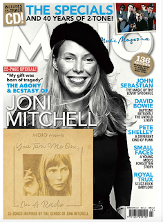
MOJO Another quick and easy revision prep, worth 5 marks. Base your analysis on MOJO's March 2019 issue. the exam question won't have the covermount (free CD) so don't refer to it.


The MOJO magazine utilizes the use of a monochromatic colour palette with accents of blue. These bland colours connote a serious tone and the blues could reflect the music artists modernity. This idea of the monochromatic colour palette is reinforced by the choice to make the main splash, Joni Mitchell, a black and white photo. The use of the phrase 'The angony and ecstasy' can also hint towards the idea of her potentially traumatic music life. There is also an atmosphere of seriousness and importance with the use of a sans serif font for the main splash title.

The main splash is also a bit unusual, as the world of rock is mostly male dominated, which is shown through the other stories inside the magazine on the sides of the cover. This is a counter stereotype to the MOJO magazine and can suggest that Joni is a pioneer for women in the patriarchal world of rock. This idea is reinforced by the orderly block capitals of the main splash 'JONI MITCHELL' as it connotes a masculine attire


Tuesday 22 January 2019

Exam Q.8 Revision

PREP
To revise the 'media language' question, you focus on the layout. It is a quick and easy question, worth 5 marks and only 2 examples needed. Please copy the question onto your blog and write the 2 examples taken from the recent Observer online. The answers below will help you.
Exam q.8 (5 marks, write 1/2 a page; give 2 examples)


The Guardian Observer homepage uses a variety of media language techniques in order to present the themes of the newspaper. One of the ways the Observer portrays this is through the choice of colour palette. The Observer uses royal blue colours with the Burgundy accents. These colours connote a sense of urgency and importance regarding the newspaper, implying that the newspaper will tackle hard news and won't shy away from thesse topics which it doesn't.

Another form of media language used is the layout. The layout of the news articles are also very ordered, speparated into categories. They are also alinged in columns and separated by a box outline. This means that it is easy to the eye and creates a atmosphere of importance and suggests that it is a serious newspaper.

Monday 21 January 2019

Exam Question 9 Revision


1. The major use of newspapers is to offer a sense of knowing
what is going on in the world.The Observer knows that its readers are serious and interested in international affairs. This is evident in hard news articles about.....Brexit and Donald Trump and Labours plan to topple Theresa May.
2. The Observer meets its audience's need for a range of cultural, sporting and artistic news. It provides these with...articles about the 2019 Brit awards and Dua Lipa topping it.

3. The Observer does not shy away from 'difficult' issues that could make uncomfortable reading, such as...a Saudi teen's "long journey to safety". They also openly talk about the serious crimes committed on parole soaring to 50% and the Irainian hunger strikes. 

4. The Observer has sections which are designed to appeal to
different types of readers.The Observer reflects the diversity of its readership in articles on...Politics, Education, Entertainment and Business.

5. Newspaper readership can still be used as a symbol of one’s social identity. The term ‘Guardian reader’ connotes a certain
type of social attitude and The Observer similarly reinforces
a set of social and political attitudes, and thus identity, in its
representations. For example, Observer readers like to think
of themselves as open-minded and this is reflected in the
Observer’s practice of allowing both sides of an argument
equally to be put when the newspaper is clearly on one side
of this argument. There is an example of this in....the two separate articles about Dag Hammarskjold as well as opinion pieces on Brexit. They also mention the 'Yellow vest protests' and the riots in Paris.

6. The entertainment function of newspapers may take the
form of humour. It may take the form of diversion into
a celebrity world of ‘glamour’. It may take the form of human
interest stories in which readers are invited to sympathise with
the subjects of the article. Newspapers further offer games,
puzzles, crosswords and the like. At the higher end, sections
such as the New Review in the Observer may offer the pleasure of extremely well-written think pieces and literature reviews. An example of this is....various articles on Body Image.

Monday 14 January 2019

Year 11 PREP: MUSIC VIDEO Q.2

Wheatus - Teenage Dirtbag and Avril Lavigne - Sk8er Boi
PREP: To revise for q.2 (4 marks), copy / paste each of the following descriptions into your blog post. Write either SB or TD at the start of each, to indicate either Avril or Wheatus. Some answers may refer to BOTH so put both initials.


This video is documentary style mostly hand-held camerawork, de-saturated colour and fast-paced editing.
Sk8er Boi
This video has saturated colour, more controlled camerawork, slower-paced editing.
Teenage Dirtbag
This video consists of mostly montage shots.
Sk8er Boi
This video has more developed editing with cause and effect.
Teenage Dirtbag
In this video, the singer values rebellion, which is seen in the narrative.
Sk8er Boi
In this video, the singer values 'fitting in', conformity, albeit to an oppressive system, which is seen in the 
narrative.
Teenage Dirtbag
This video is set in LA, a big city, with its connotations of street credibility.
Sk8er Boi
The mise-en-scene of this video is American suburbia with its connotations of conformity. 
Sk8er Boi
This video is intertextual in its narrative (=it makes references to high school drama).
Both
In this video, the singer performs to camera.
Both
In this video, real locations and 'everyday' costume for the performers connote a sense of naturalism.
Teenage Dirtbag more so than Sk8er Boi, as Avril wears 'rebellious clothing' which is uncommon
In this video, there is a sense of linear narrative (a story is told, in the order it unfolds)
Both